SwiftUI Liquid Glass - Regular vs Clear
Table of Contents
In iOS 26, we can use the glassEffect() modifier to apply Liquid Glass to a view.
In this article, we will look at two Liquid Glass variants, .regular and .clear, and how they affect the color of text and symbols.
How to use regular and clear Liquid Glass
To choose a variant, pass .regular or .clear to the glassEffect() modifier.
toolbar
    .glassEffect(.regular)

toolbar
    .glassEffect(.clear)
The default is .regular, so .glassEffect() and .glassEffect(.regular) produce the same result.
The two variants have different appearances.
- Regular blurs the content behind the glass to help text and symbols stay readable.
- Clear is more transparent, allowing more of the background to show through.
Apple recommends regular glass for most controls and navigation, and clear glass for controls over photos and videos. You can read more in the Human Interface Guidelines.
Let's compare them using a row of three symbols.
HStack(spacing: 28) {
    Image(systemName: "trash")
    Image(systemName: "folder")
    Image(systemName: "arrowshape.turn.up.left")
}
.padding(.horizontal, 28)
.padding(.vertical, 18)
.glassEffect(.regular)
For the clear version, we only change the last line to .glassEffect(.clear).
You can easily support sarunw.com by checking out this sponsor.

Offline Transcription: Fast, privacy-focus way to transcribe audio, video, and podcast files. No data leaves your Mac.
How the foreground color changes
We don't set a foreground color in this example. This lets us see how each variant handles the default color of the symbols.
Both examples below use Light Mode. We only change the wallpaper behind the toolbar.
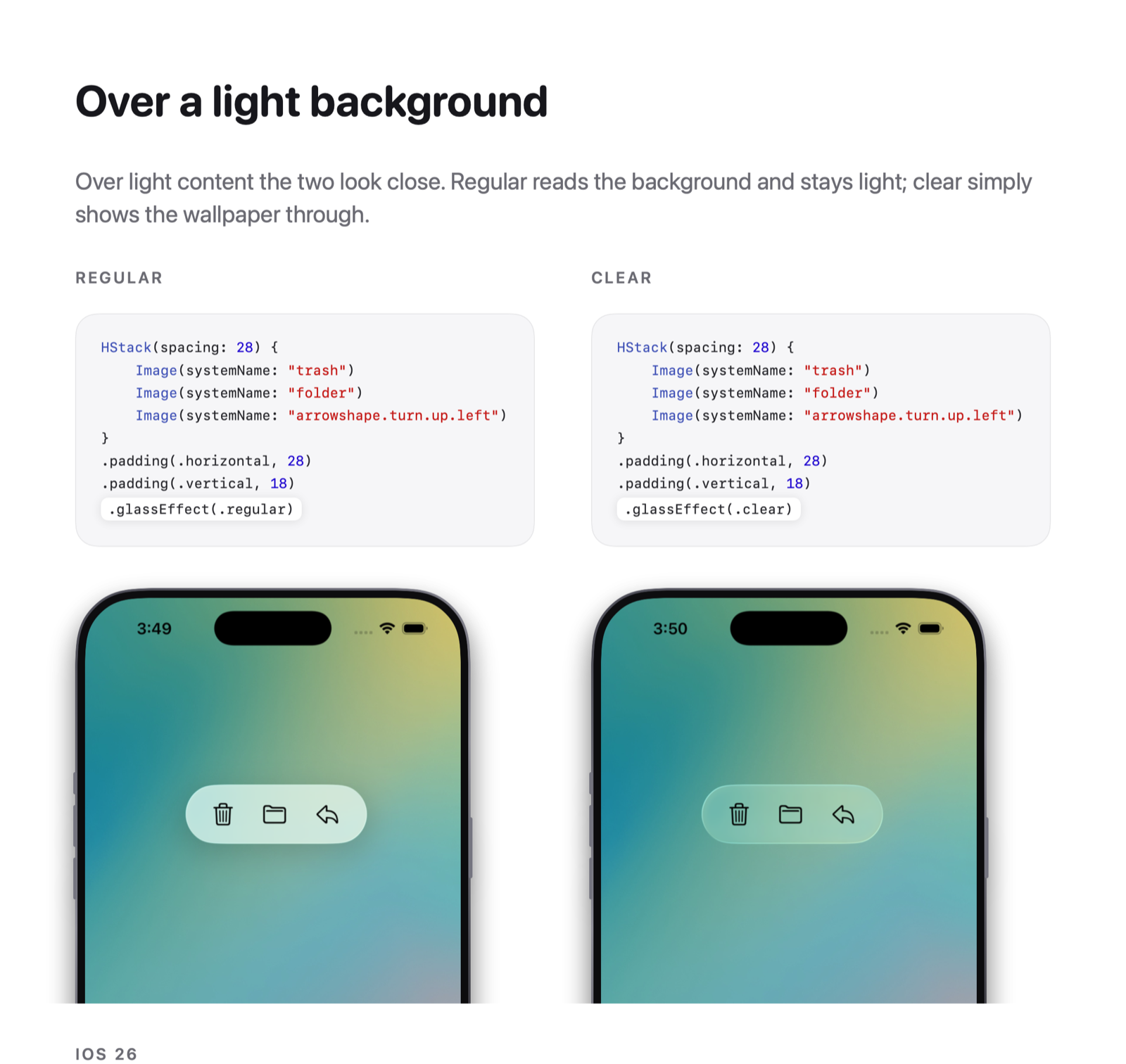
Over a light background
On a light wallpaper, both variants show dark symbols.
The difference is easier to see in the glass itself. Regular glass blurs more of the wallpaper, while clear glass lets us see more detail.
Over a dark background
When we change to a dark wallpaper, the foreground colors differ.
- With regular glass, the symbols become light.
- With clear glass, the symbols remain dark and become difficult to see.
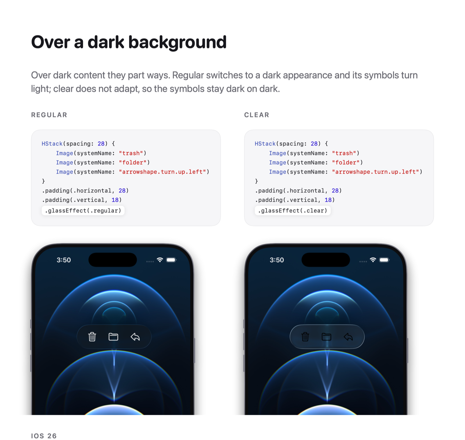
Regular glass can adapt its default foreground to the background. In this example, it changes the symbols to a light color so we can still see them.
Clear glass keeps the default foreground from the view's color scheme in this example. A dark wallpaper doesn't switch the view to Dark Mode, so the symbols stay dark.
Light Mode vs Dark Mode
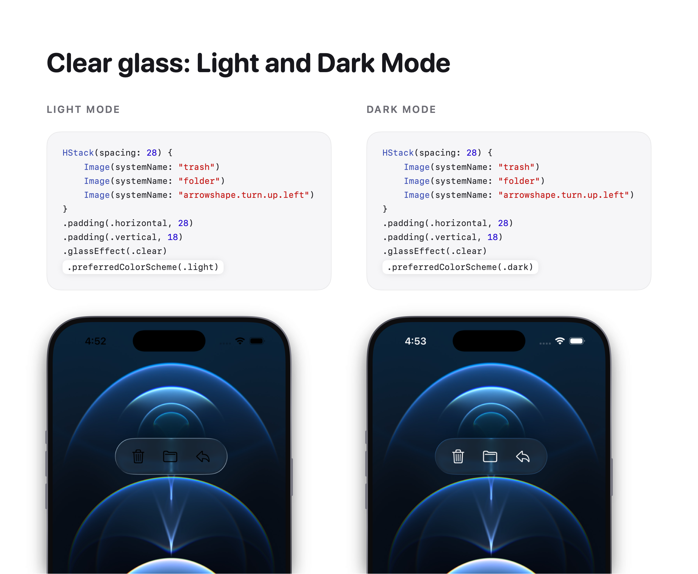
Now, let's keep the same dark wallpaper and change the color scheme instead.
We can use preferredColorScheme(_:) to compare Light Mode and Dark Mode.
// Light Mode
toolbar
    .glassEffect(.clear)
    .preferredColorScheme(.light)

// Dark Mode
toolbar
    .glassEffect(.clear)
    .preferredColorScheme(.dark)
With clear glass, the default symbols are dark in Light Mode and light in Dark Mode. The wallpaper is the same in both examples.
Does the color scheme affect regular glass?
We can repeat the same comparison with .regular.
// Light Mode
toolbar
    .glassEffect(.regular)
    .preferredColorScheme(.light)

// Dark Mode
toolbar
    .glassEffect(.regular)
    .preferredColorScheme(.dark)
With regular glass, the symbols stay light in both examples. Regular glass adapts to the dark wallpaper, even when the view uses Light Mode.
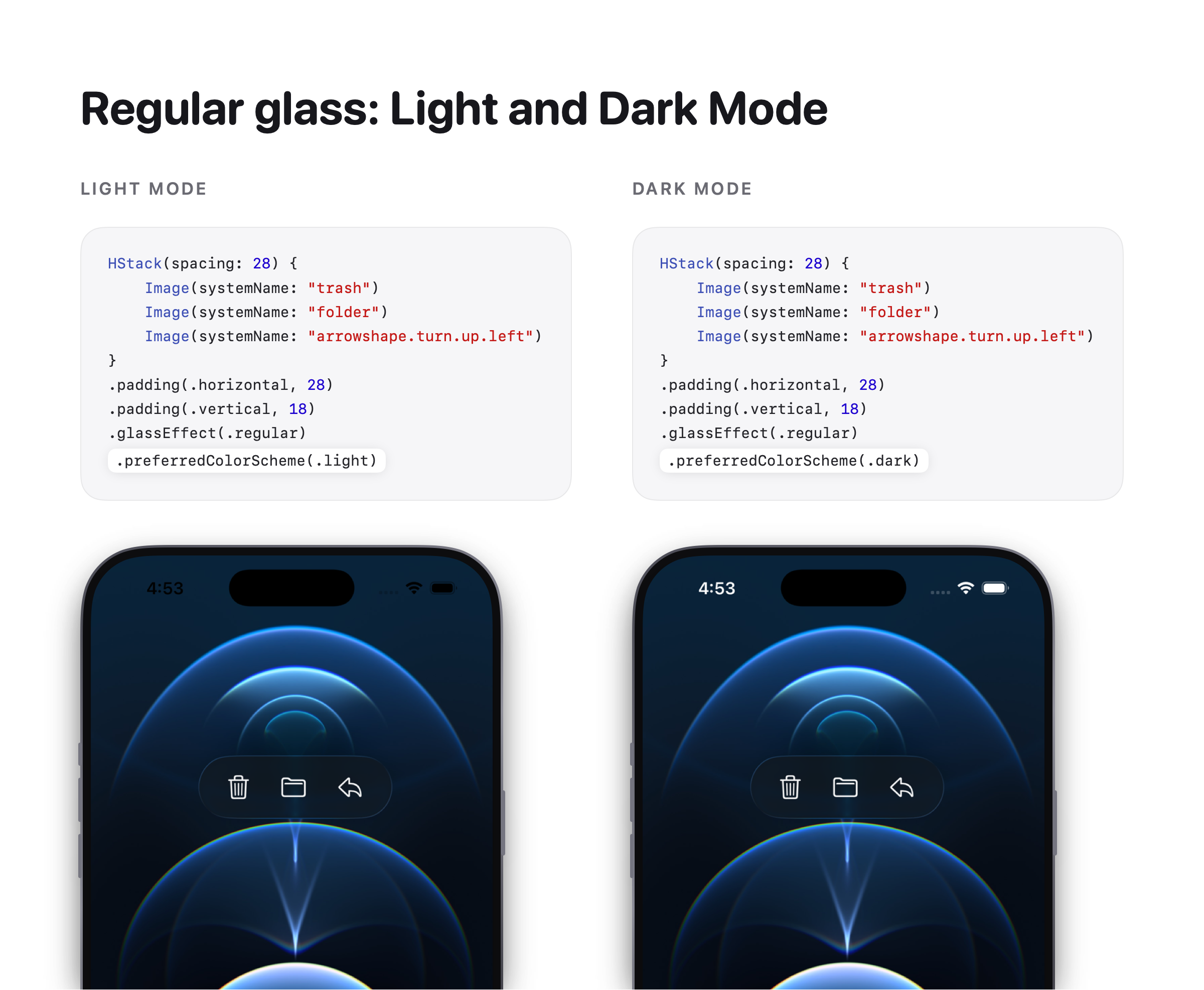
The color scheme still applies to the view, but regular glass's automatic foreground adaptation works independently of Light and Dark Mode. Apple explains this behavior in Explore the biggest updates from WWDC25.
So, switching color schemes doesn't necessarily change the foreground of regular glass. In this toolbar, the background determines which foreground gives better contrast.
You can easily support sarunw.com by checking out this sponsor.
Offline Transcription: Fast, privacy-focus way to transcribe audio, video, and podcast files. No data leaves your Mac.
Which variant should you use
Use .regular for most controls and navigation, especially when the background can change. It helps keep the default text and symbols readable.
Use .clear for controls over photos or videos when you want more of the content to remain visible. Check the foreground color against the media, and add dimming when needed.
Read more article about SwiftUI, iOS 26, Liquid Glass, or see all available topic
Enjoy the read?
If you enjoy this article, you can subscribe to the weekly newsletter.
Every Friday, you'll get a quick recap of all articles and tips posted on this site. No strings attached. Unsubscribe anytime.
Feel free to follow me on Twitter and ask your questions related to this post. Thanks for reading and see you next time.
I also make short videos and visual guides on Patreon. Some things are easier to see than to read, like how an API looks and moves on a real screen. If you like to learn that way, come and watch. Sharing the article is also greatly appreciated.
Become a patron Tweet ShareThe new JSON project format in Xcode 27.2
Xcode 27.2 replaces project.pbxproj with project.xcproj, a JSON file. See what changed, how to convert an existing project, and which Xcode versions can still open it.
How native SwiftUI controls look different in iOS 26
Compare native SwiftUI buttons, toggles, pickers, sliders, toolbars, tab bars, and sheets before and after the iOS 26 redesign.