Why the navigation title moves to the left in iOS 26
Table of Contents
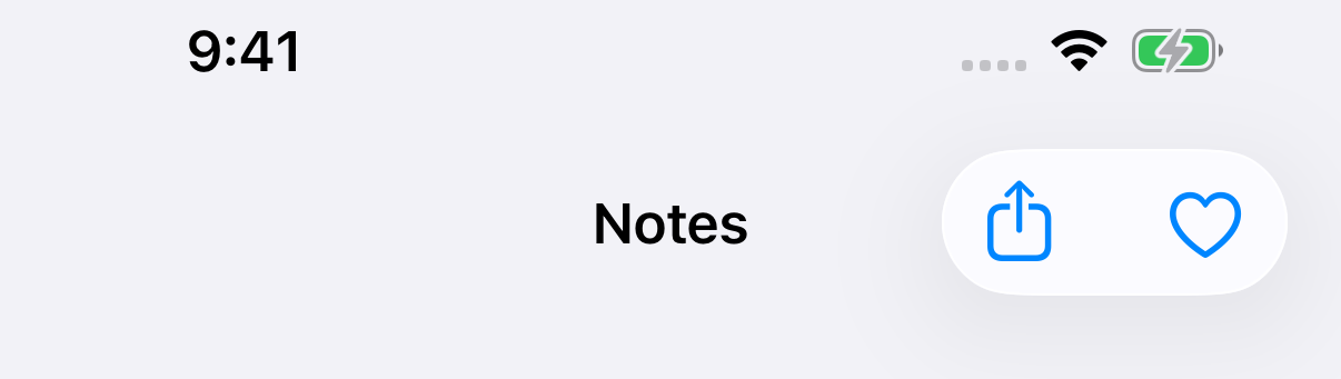
In iOS 26, an inline navigation title isn't always in the middle of the bar. It stays centered only when it fits. When the toolbar items take that space, the title moves to the leading edge.
One more item moves the title
Every screen in this post uses the same code. Only the number of buttons changes.
List {
    // ...
}
.navigationTitle("Notes")
.navigationBarTitleDisplayMode(.inline)
.toolbar {
    ToolbarItemGroup(placement: .topBarTrailing) {
        Button("Share", systemImage: "square.and.arrow.up") { }
        Button("Favorite", systemImage: "heart") { }
    }
}
With two buttons, the title is centered.
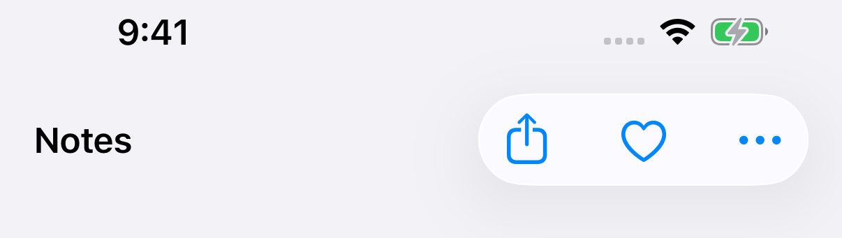
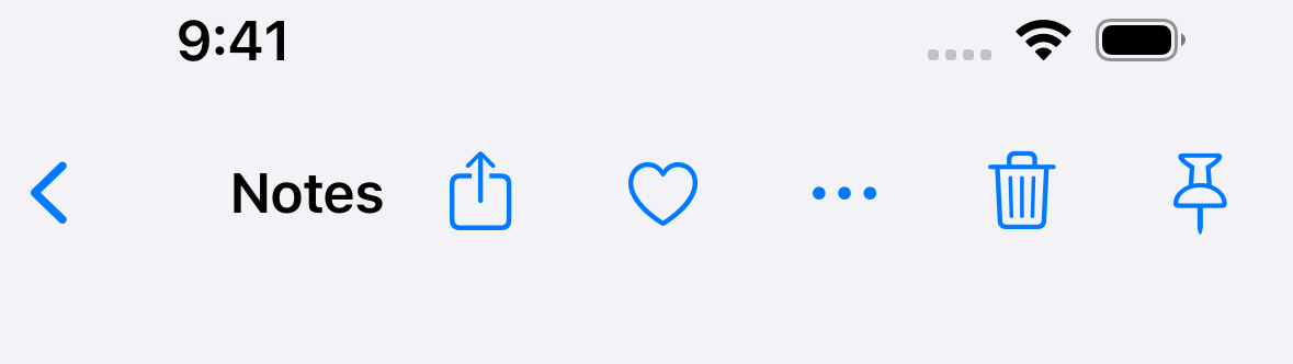
Add a third button.
.toolbar {
    ToolbarItemGroup(placement: .topBarTrailing) {
        Button("Share", systemImage: "square.and.arrow.up") { }
        Button("Favorite", systemImage: "heart") { }
        Button("More", systemImage: "ellipsis") { }
    }
}
The capsule is now wide enough to reach where a centered title would be. So the title moves all the way to the leading edge.
You can easily support sarunw.com by checking out this sponsor.

AI Paraphrase:Are you tired of staring at your screen, struggling to rephrase sentences, or trying to find the perfect words for your text?
It's about space, not the number of items
The rule is not "three items or more". It is whether the centered title would touch the items.
A longer title hits the same limit with only two buttons.
.navigationTitle("Weekend Groceries")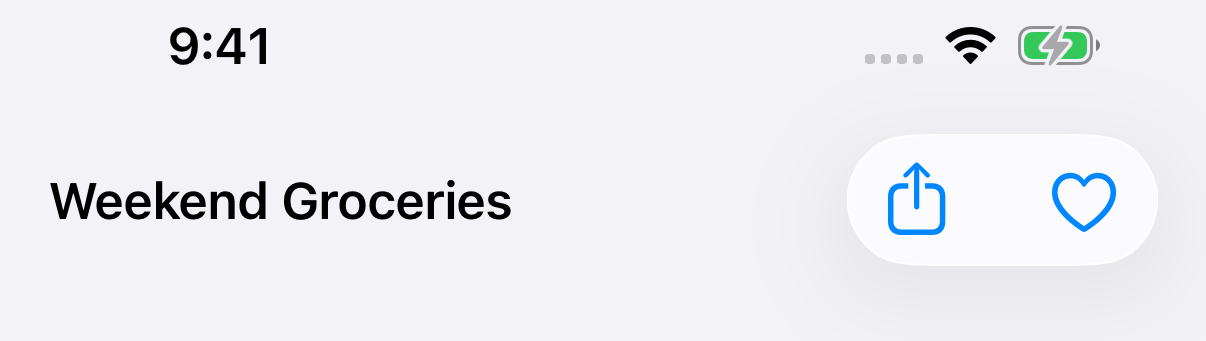
This also means the same screen can look different on a smaller iPhone, with a larger text size, or in another language with longer words.
With a back button
A pushed screen has a back button on the leading edge. The rule is the same.
With two items, there is room in the middle, so the title stays centered.
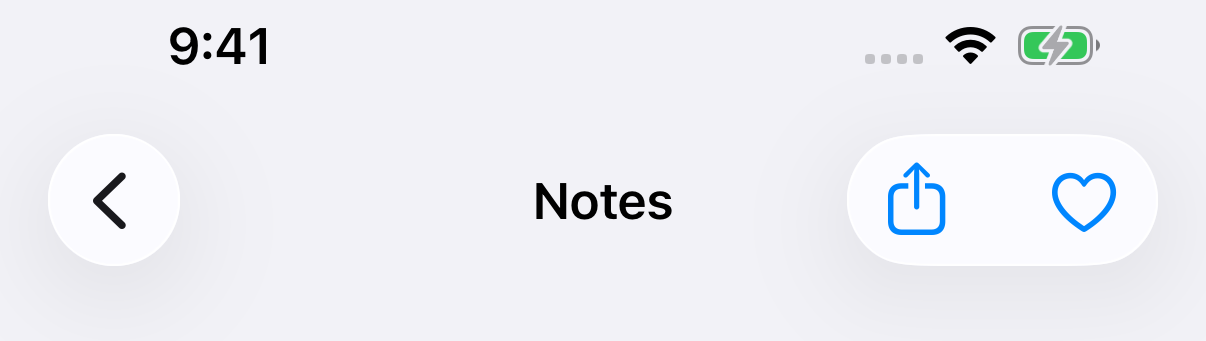
With three, the title moves to the leading side and sits right after the back button.
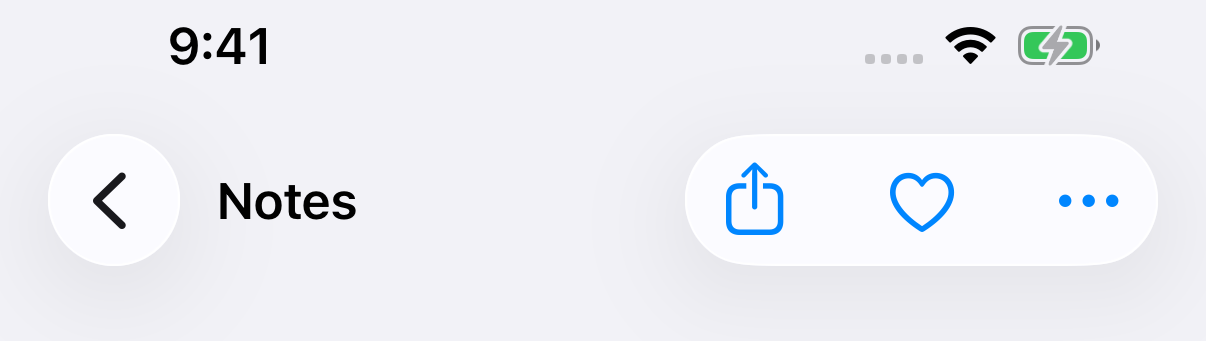
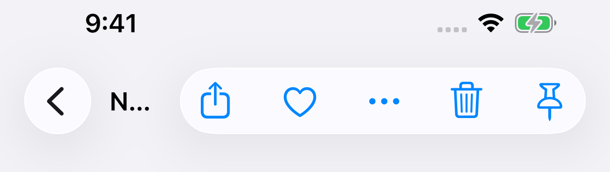
Keep adding items, and the title runs out of room. iOS cuts the title short, not the buttons. With five items, "Notes" becomes "N…".
Before iOS 26
This is new in iOS 26. On iOS 17, the title tried hard to stay in the middle.
Here is the same three-button code on iOS 17.5. The title is still centered.
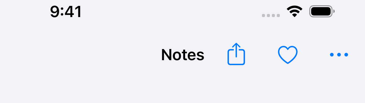
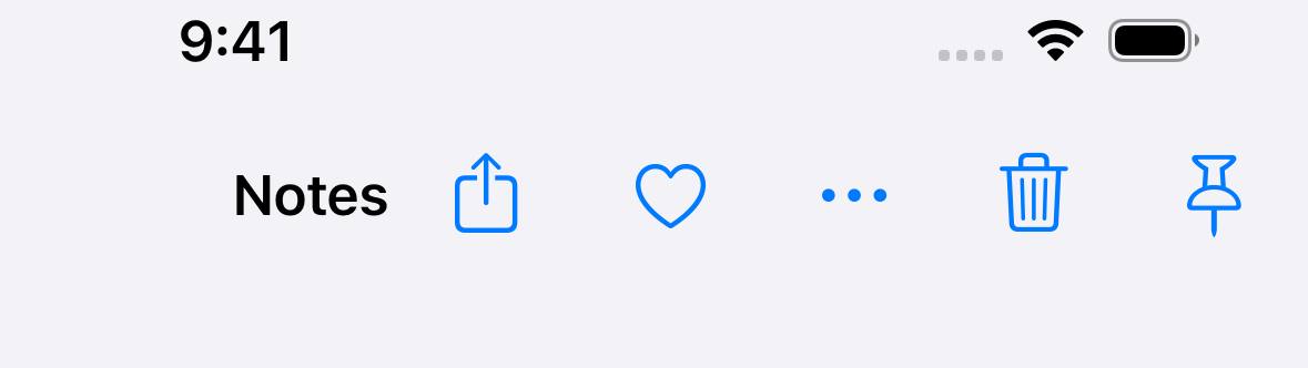
With five buttons, the title moves, but only as far as it has to. It sits in the middle of the free space, not at the edge.
With a back button, iOS 17 gave up something else first. The back button lost its "Folders" label, and the title kept its full text.
iOS 26 does the opposite. Its back button is only a chevron, with no label to give up, so the title is the thing that shrinks.
What to do about it
Nothing, if a title on the left looks fine to you. This is how the system lays out the bar.
If you want it centered, give it the space:
- Fewer trailing items. Move actions people use less often into a
Menu. One menu button takes the space of one item. - A shorter title. Check the longest translation too, not only English.
On a pushed screen with many actions, keep the title short. Otherwise, people may only see its first letter.
You can easily support sarunw.com by checking out this sponsor.
AI Paraphrase:Are you tired of staring at your screen, struggling to rephrase sentences, or trying to find the perfect words for your text?
Summary
- An inline title is centered only when it fits between the leading and trailing items.
- When it doesn't fit, iOS 26 moves it to the leading edge, or right after the back button.
- When there is still no room, the title is cut short. The buttons stay.
- iOS 17 kept the title in the middle of the free space, and dropped the back button's label before cutting the title.
Read more article about SwiftUI, Toolbar, iOS 26, or see all available topic
Enjoy the read?
If you enjoy this article, you can subscribe to the weekly newsletter.
Every Friday, you'll get a quick recap of all articles and tips posted on this site. No strings attached. Unsubscribe anytime.
Feel free to follow me on Twitter and ask your questions related to this post. Thanks for reading and see you next time.
I also make short videos and visual guides on Patreon. Some things are easier to see than to read, like how an API looks and moves on a real screen. If you like to learn that way, come and watch. Sharing the article is also greatly appreciated.
Become a patron Tweet ShareToolbar overflow and visibility priority on iPhone Duo
Choosing between the toolbar and tab bar, consolidating overflow, setting visibility priority, and when to turn vertical bars off.
Get concentric corner radii from GeometryReader in iOS 27
iOS 27 adds concentricCornerRadii to GeometryProxy. It tells you the corner radii a view needs to match the corners of its container or the screen.