How to preview a device in landscape orientation with SwiftUI Previews
Table of Contents
SwiftUI Previews is one of the features I really like. It helps you iterate and build views in real-time, and more importantly, you can test on multiple device conditions such as light/dark mode, different locales simultaneously. This makes creating a view in SwiftUI a pleasant experience.
Unfortunately, we don't have a built-in way to preview for a device in landscape orientation at the moment (Xcode 12). To mitigate the problem, I will show how I simulate and test a landscape layout in SwiftUI.
What is landscape
To simulate a landscape layout, we need to understand what is landscape really means in iOS. Apple ditch the concept of portrait and landscape years ago (around iOS 8) when they introduce the new idea of size classes.
In size classes, we no longer interpret device rotation as a change of device's orientation (portrait to landscape), but a change of view size and size class (compact and regular).
Landscape and portrait is a change of view size and size class (compact and regular).
The statement above is the key to our implementation.
You can easily support sarunw.com by checking out this sponsor.

AI Grammar: Correct grammar, spell check, check punctuation, and parphrase.
Where can I find size and size class for landscape orientation
We now know that landscape is a change of size and size class, but what size and size classes will we use for each device?
Size
Finding size for landscape orientation is straightforward. You just get your device resolution in points (pixels divided by scale factor) and swap the width and height. You can check out the device display size here.
For example, the iPhone X in portrait orientation of size 375x812 will become 812x375 in landscape orientation.
Size Classes
Landscape size classes for each device are different, as you can see in Apple Human Interface Guidelines – Device Size Classes.
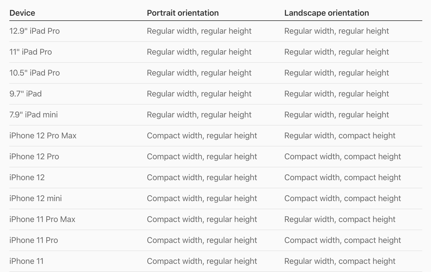
Luckily we still have a way to categorize them into groups that I will discuss later in Improvement section.
Implementation
We have everything ready to implement a landscape orientation for SwiftUI Previews. I will start with an example of landscape orientation for iPhone 12 Pro.
Here is our content view.
struct ContentView: View {
    var body: some View {
        ZStack {
            Color.pink
            VStack {
                Text("Hello, SwiftUI!")
                    .font(.largeTitle)
                    .bold()
                Spacer()
            }
        }
    }
}
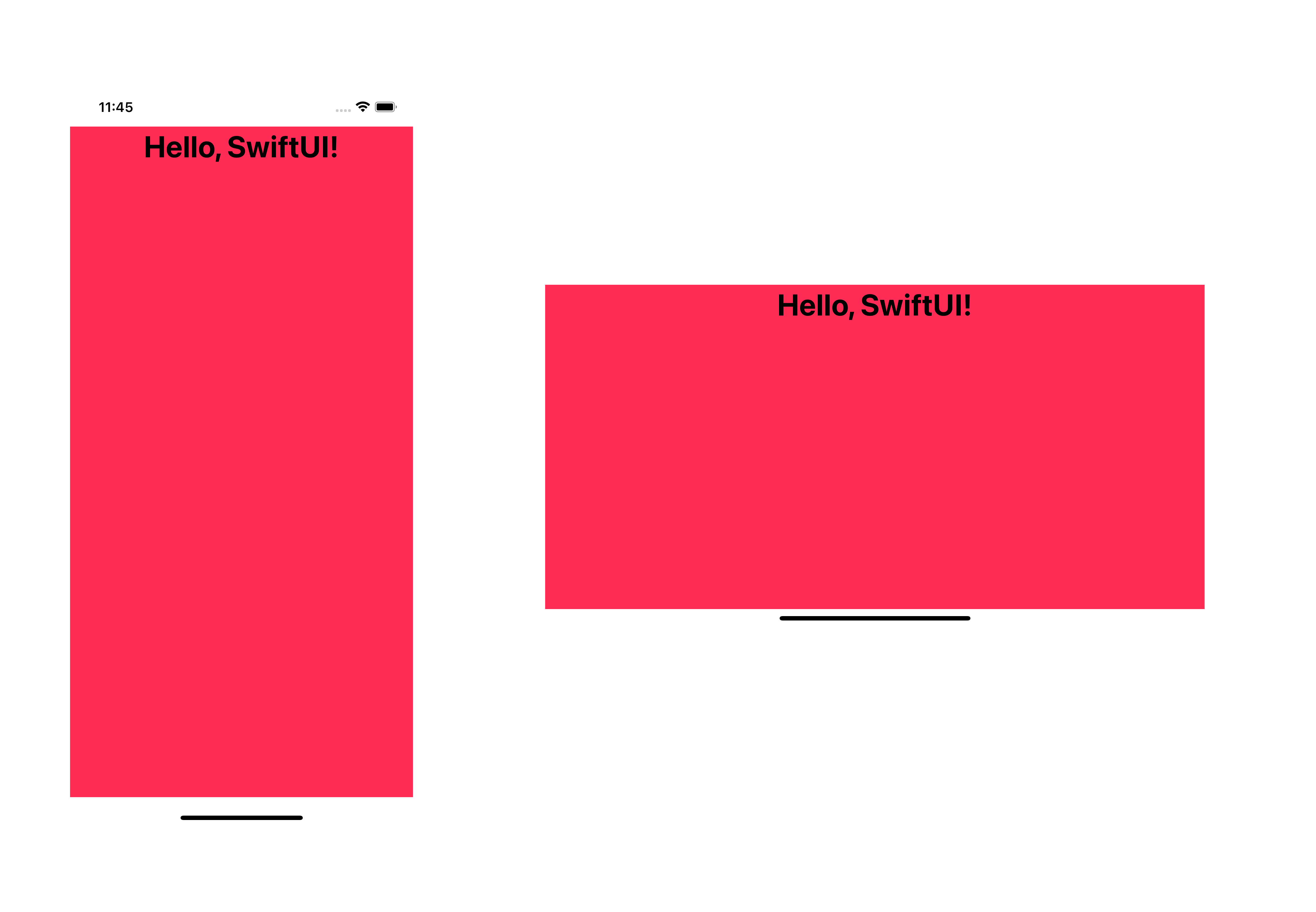
Run the app, and this is how it looks in portrait and landscape orientation.
To preview our view in landscape orientation, we modify the size and size classes of our view.
struct ContentView_Previews: PreviewProvider {
    static var previews: some View {
        ContentView()
            .previewLayout(.fixed(width: 812, height: 375)) // 1
            .environment(\.horizontalSizeClass, .compact) // 2
            .environment(\.verticalSizeClass, .compact) // 3
    }
}
<1> We set preview size with .previewLayout(.fixed(width: 812, height: 375)). Portrait orientation of iPhone 12 Pro is 375x812, so the size for landscape orientation is 812x375.
<2>, <3> From the Apple Human Interface Guidelines – Device Size Classes, iPhone 12 Pro has compact width (.horizontalSizeClass) and height (.verticalSizeClass) size class. We can set both values via .environment modifier.
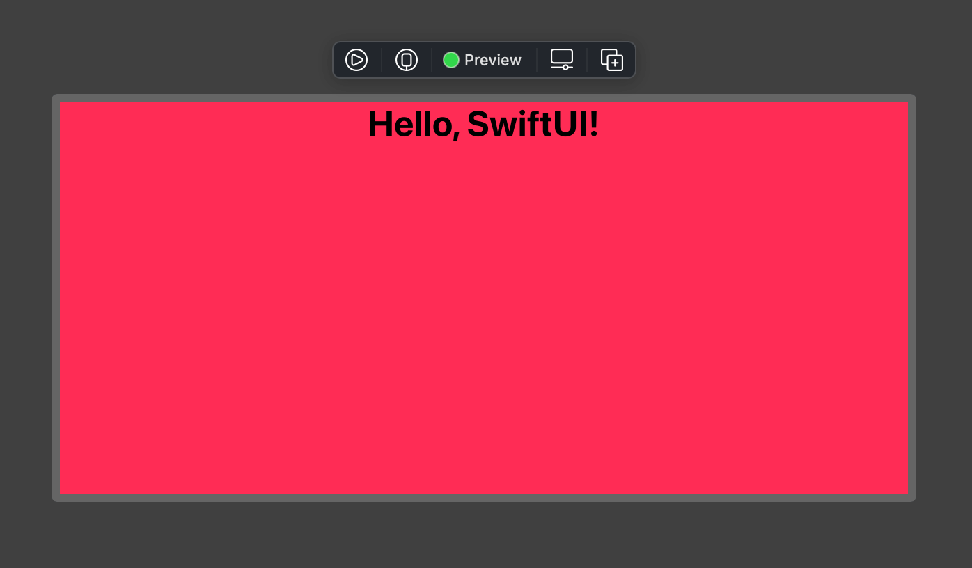
Result:
Caveat
The only caveat I see so far is our landscape preview won't have proper safe area insets as you can see in the result.
Improvement
Our implementation is working fine. But the fact that we hard-coded iPhone 12 Pro values (size and size classes) makes it not convenient to use if you want to test on other device models. That's the improvement that I want to make.
View Modifier
The first improvement I want to make is creating a new view modifier for our landscape orientation. This would make it easier to reuse.
struct LandscapeModifier: ViewModifier {
    func body(content: Content) -> some View {
        content
            .previewLayout(.fixed(width: 812, height: 375))
            .environment(\.horizontalSizeClass, .compact)
            .environment(\.verticalSizeClass, .compact)
    }
}

extension View {
    func landscape() -> some View {
        self.modifier(LandscapeModifier())
    }
}
Now, we can preview any view in landscape orientation with the .landscape() modifier.
struct ContentView_Previews: PreviewProvider {
    static var previews: some View {
        ContentView()
            .landscape()
    }
}
View modifier makes it easier to use and reuse, but we still hard-coded our device to iPhone 12 Pro. We will make our size dynamic in the next improvement.
Dynamic Size
To make our size adapt to the current size, we need to update our LandscapeModifier to use the current device width and height instead of the hard-coded value.
struct LandscapeModifier: ViewModifier {
    let height = UIScreen.main.bounds.width // 1
    let width = UIScreen.main.bounds.height // 2

    func body(content: Content) -> some View {
        content
            .previewLayout(.fixed(width: width, height: height)) // 3
            .environment(\.horizontalSizeClass, .compact)
            .environment(\.verticalSizeClass, .compact)
    }
}
<1> In landscape orientation, a device width becomes height.
<2> A device height becomes width.
<3> We use this new width and height instead of our hard-coded value.
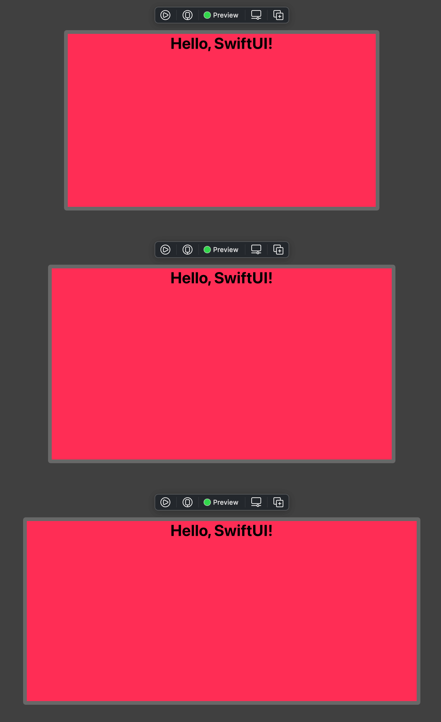
Here is an example of previews using .landscape in different device sizes.
struct ContentView_Previews: PreviewProvider {
    static var previews: some View {
        ContentView()
            .previewDevice(PreviewDevice(rawValue: "iPhone 8"))
            .landscape()
        ContentView()
            .previewDevice(PreviewDevice(rawValue: "iPhone 8 Plus"))
            .landscape()
        ContentView() // iPhone 12 Pro
            .landscape()
    }
}As you can see, we can test landscape orientation for any device model.
Dynamic Size Classes
The only thing left for improvement is size classes. Size classes can be compact and regular vary based on the device model. You can see size classes for each device in Apple Human Interface Guidelines – Device Size Classes.
We can roughly classify them into three groups.
- iPad: iPad has both regular width and height size class in landscape orientation.
- iPhone: iPhone has a compact height.
- Compact width iPhone: Most small size iPhone fall in this group such as iPhone 5, SE, 6, 6s, X, Xs, 12, 12 Pro
- Regular width iPhone: Only three models fall in this group.
- Plus model: Such as 6+, 7+, 8+
- XR and 11
- Max model: iPhone XS Max, 11 Pro Max, 12 Pro Max
So we can simplify them into three groups as follow.
- iPad: regular width and regular height.
- Small iPhone: compact width and compact height.
- Large iPhone: regular width and compact height.
We will use this information to modify our LandscapeModifier to return the correct size classes for each model.
Final implementation
Here is our final implementation.
struct LandscapeModifier: ViewModifier {
    let height = UIScreen.main.bounds.width
    let width = UIScreen.main.bounds.height

    var isPad: Bool { // 1
        return height >= 768
    }

    var isRegularWidth: Bool { // 2
        return height >= 414
    }

    func body(content: Content) -> some View {
        content
            .previewLayout(.fixed(width: width, height: height))
            .environment(\.horizontalSizeClass, isRegularWidth ? .regular: .compact) // 5
            .environment(\.verticalSizeClass, isPad ? .regular: .compact) // 6
    }
}
<1> We create the isPad variable to check whether the device is iPad. We do this by checking landscape height (portrait width), whether larger or equal to 768 points or not (The smallest iPad width is 768).
<2> We create the isRegularWidth variable to check for the device with regular width. Which are iPad and some big-screen iPhone models. Fortunately, they all have one thing in common: their landscape height is greater or equals to 414.
<5> For .horizontalSizeClass, we set it to regular size class only if the device is iPad or large iPhone (isRegularWidth equals true).
<6> For .verticalSizeClass, we set it to regular size class for iPad devices (isPad equals true).
To test this, let change our content view a bit. We will use a view that can adapt to the size classes, NavigationView.
struct ContentView: View {
    var body: some View {
        NavigationView {
            Text("Sidebar")
            Text("Detail")
        }
    }
}
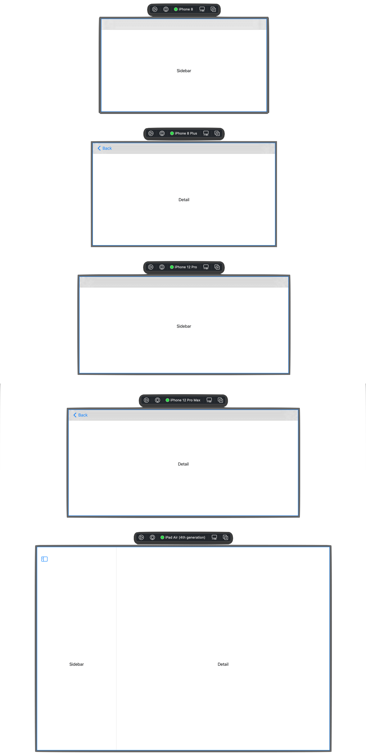
Then we test it against multiple devices.
struct ContentView_Previews: PreviewProvider {
    static var previews: some View {
        ContentView2()
            .previewDevice(PreviewDevice(rawValue: "iPhone 8"))
            .previewDisplayName("iPhone 8")
            .landscape()
        ContentView2()
            .previewDevice(PreviewDevice(rawValue: "iPhone 8 Plus"))
            .previewDisplayName("iPhone 8 Plus")
            .landscape()
        ContentView2()
            .previewDisplayName("iPhone 12 Pro")
            .landscape()
        ContentView2()
            .previewDevice(PreviewDevice(rawValue: "iPhone 12 Pro Max"))
            .previewDisplayName("iPhone 12 Pro Max")
            .landscape()
        ContentView2()
            .previewDevice(PreviewDevice(rawValue: "iPad Air (4th generation)"))
            .previewDisplayName("iPad Air (4th generation)")
            .landscape()
    }
}
You can see that navigation correctly adapts to the device's size classes.
You can easily support sarunw.com by checking out this sponsor.

AI Grammar: Correct grammar, spell check, check punctuation, and parphrase.
Conclusion
The solution shown in this article might be likely to break in the future if there are some size classes or device size changes that do not follow our assumption. But I think it is good enough for the testing purpose.
Here is a Github's gist for you to copy over.
Read more article about SwiftUI, Xcode, or see all available topic
Enjoy the read?
If you enjoy this article, you can subscribe to the weekly newsletter.
Every Friday, you'll get a quick recap of all articles and tips posted on this site. No strings attached. Unsubscribe anytime.
Feel free to follow me on Twitter and ask your questions related to this post. Thanks for reading and see you next time.
If you enjoy my writing, please check out my Patreon https://www.patreon.com/sarunw and become my supporter. Sharing the article is also greatly appreciated.
Become a patron Buy me a coffee Tweet ShareNSAttributedString in SwiftUI
Find out what is the SwiftUI way of styling portions of text.
How to add background to your view in SwiftUI
Learn how hard or easy it is to add a background view in SwiftUI.