Opt in to vertical bars on iPhone Duo
Table of Contents
Part 1 in the series "Vertical bars on iPhone Duo", based on Apple's Raise the bar with iPhone Duo talk.
- Opt in to vertical bars on iPhone Duo
- Prepare toolbar items for a vertical bar
- Adapt custom toolbar views for iPhone Duo
- Toolbar overflow and visibility priority on iPhone Duo
On iPhone Duo, navigation controls, toolbar items, and tabs can move from the top and bottom of the screen to the side. I covered the design reasoning in Adapting controls for iPhone Duo.
This series is about the code. We'll learn how the vertical bar behaves and how to position items in it.
What you need to opt in
Two things.
First, rebuild your app with the latest SDK. Nothing here is available to an app built against an older SDK. If you want the details on what else changes when you rebuild, see Backward compatibility on iPhone Duo.
Second, use the bars that navigation containers give you. The system can only move a bar it owns.
In SwiftUI, that means pairing the toolbar modifier with a container such as NavigationStack, NavigationSplitView, or TabView:
var body: some View {
    NavigationStack {
        ContentView()
            .toolbar {
                ToolbarItem(placement: .bottomBar) {
                    // ...
                }
            }
    }
}
In UIKit, prefer UINavigationController and UITabBarController. Set toolbar items on your view controller and let the navigation controller place them:
// Do this
navigationItem.trailingItemGroups = [UIBarButtonItemGroup(/* ... */)]

// Not this
let toolbar = UIToolbar()
toolbar.items = [/* ... */]
If you build your own bar out of UIToolbar, UINavigationBar, or UITabBar, its content is not considered at all. The system doesn't know those items are bar items, so they stay exactly where you put them.
You can easily support sarunw.com by checking out this sponsor.

Localization Buddy: Easiest way to localize and update App Store metadata.
The shared bar region
Once you opt in, items that used to be on top and bottom move to one shared region along the edge.
It can contain
- a toolbar.
- a tab bar.
- a navigation bar.
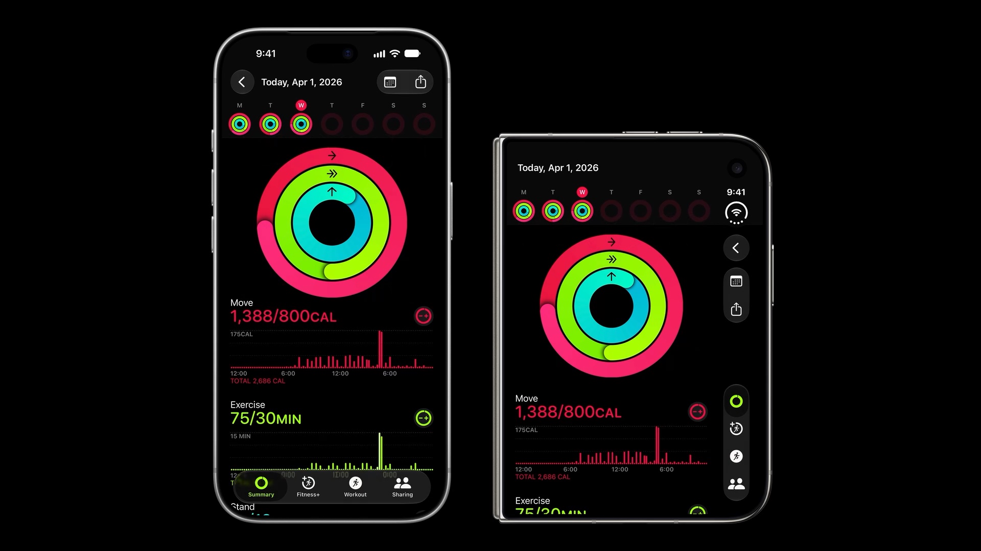
Which containers get a vertical bar
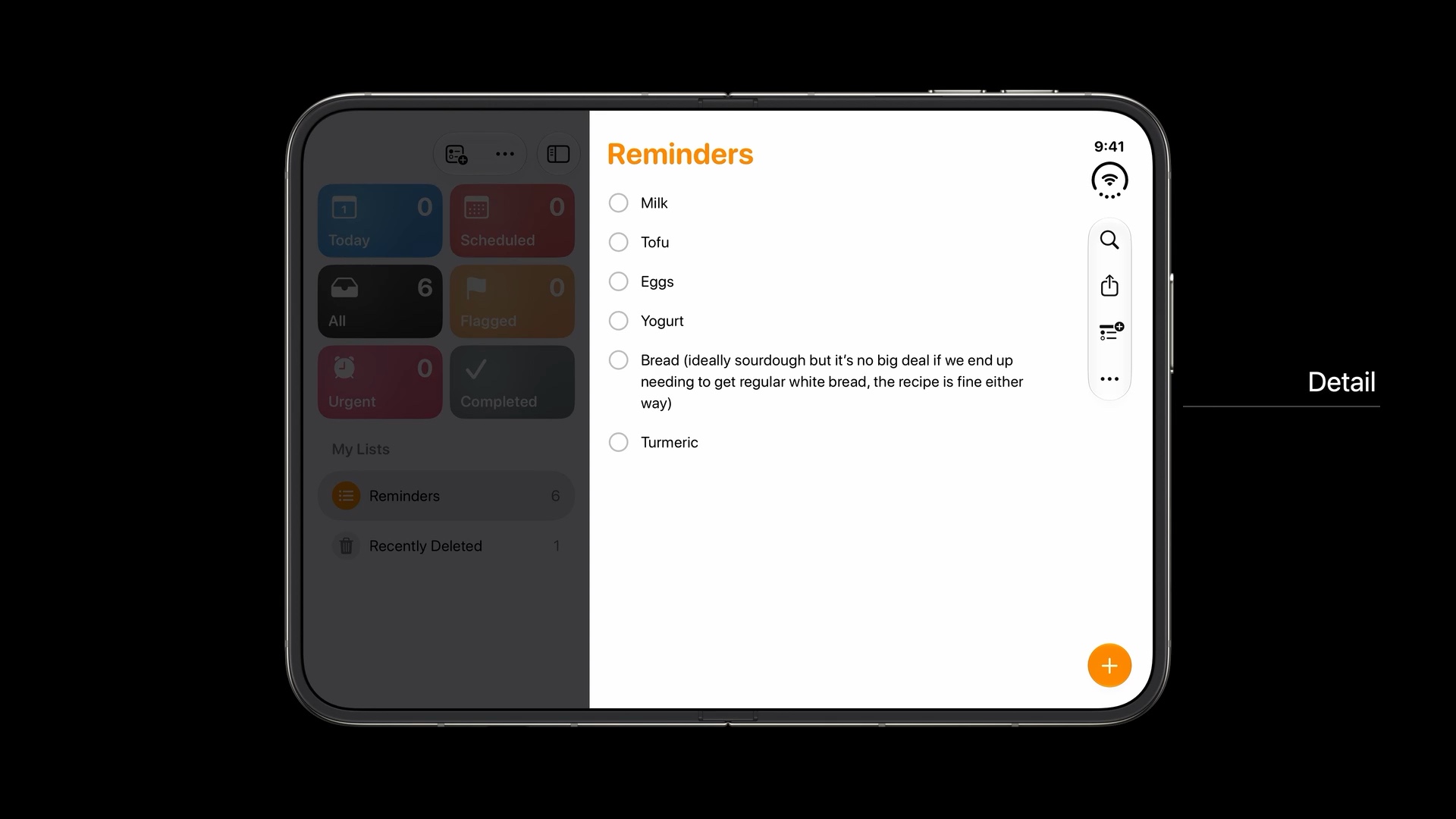
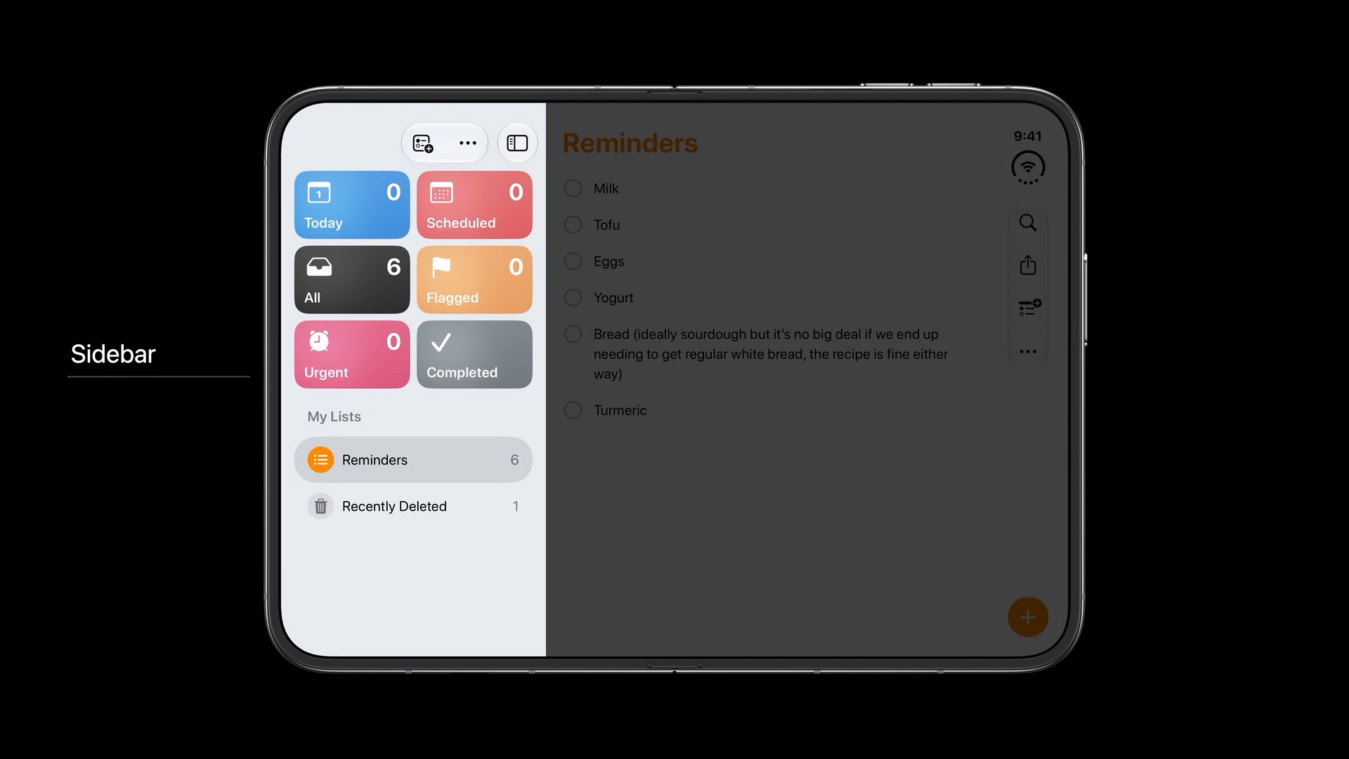
Not every bar in a complex layout goes vertical. A bar only moves when its container sits along the display edge.
| Container | Gets a vertical bar? |
|---|---|
| Split view detail column | Yes |
| Other split view columns | No, items stay horizontal |
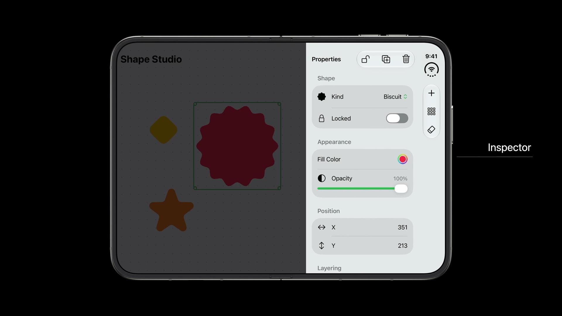
| Container | Gets a vertical bar? |
|---|---|
| Inspector | No |
| Sheet on the outer display | Yes, if it already has a toolbar |
| Sheet on the inner display | No by default, items stay horizontal |
Inspectors are the interesting case. The detail column already has a vertical bar, so giving the expanded inspector another one would be confusing. It doesn't get one.
A sheet shows vertical controls on the outer display and horizontal controls on the inner display.
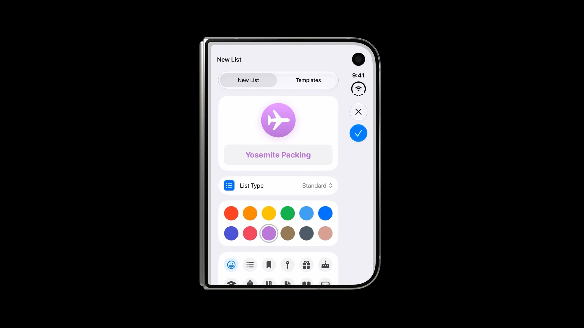
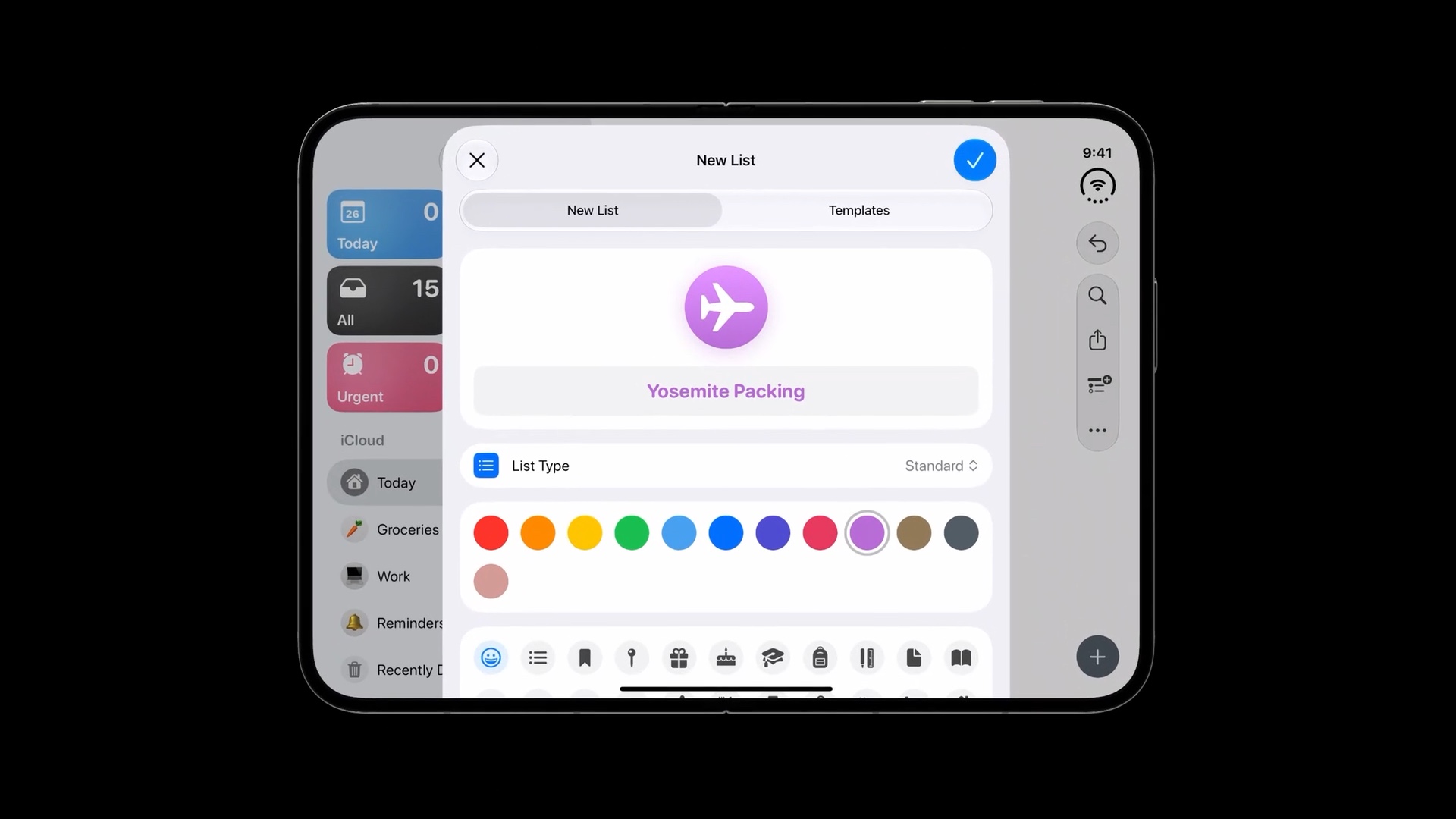
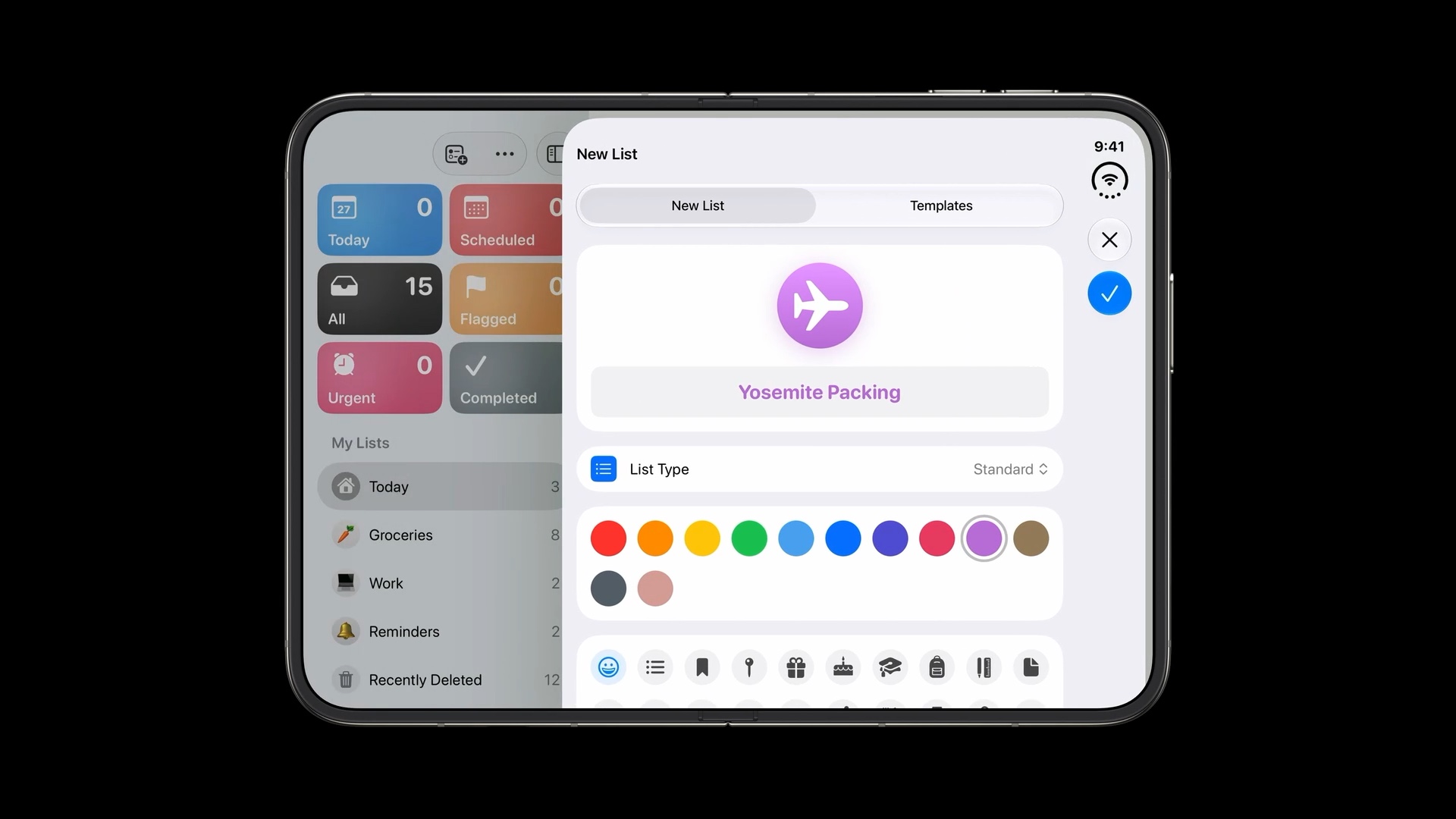
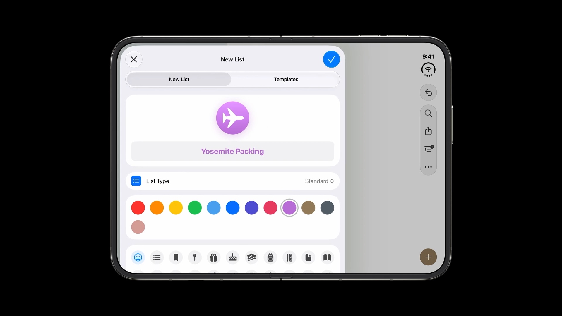
If you move a sheet with the preferredPlacement API:
- a sheet placed on the right gets a vertical bar
- a sheet placed on the left gets a horizontal one
Vertical bar position based on hardware
The bar is aligned with the hardware, not with the reading direction. In right-to-left languages it stays on the same side of the device. Your content adapts around it; the bar itself doesn't move.
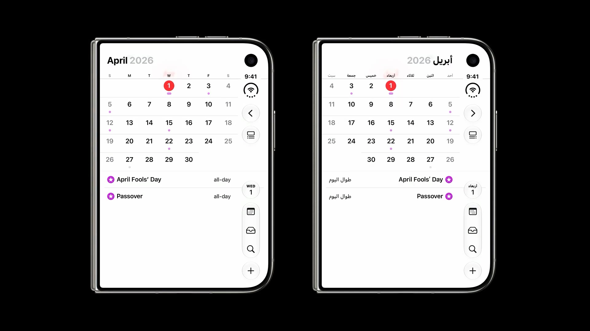
TLDR: keep controls with the right container. There are so many variations and movements beyond a simple horizontal or vertical axis.
The order items appear in
The recommended order of items from top to bottom is:
- Primary navigation at the top, such as back or close.
- Prominent actions next, such as Done.
- Everything else below, keeping its original grouping.
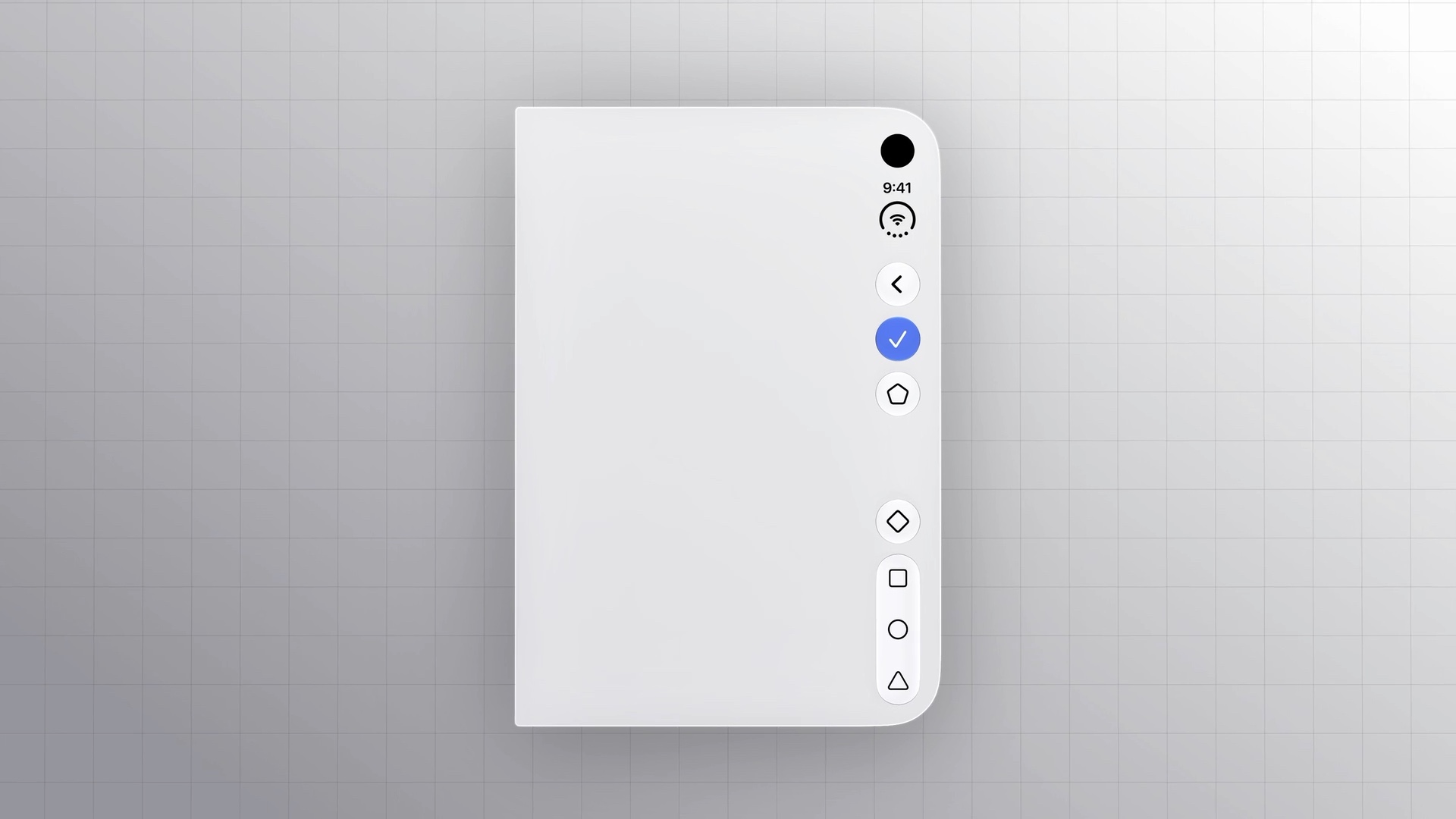
Back and close buttons
With a navigation controller you get the back button for free. For a custom back or close button, use the cancellation action placement:
// SwiftUI
.toolbar {
    ToolbarItem(placement: .cancellationAction) {
        // ...
    }
}
// UIKit
navigationItem.leftItemsSupplementBackButton = false
navigationItem.leadingItemGroups = [UIBarButtonItemGroup(/* ... */)]
leftItemsSupplementBackButton is false by default, so you usually have nothing to change. It's worth checking if you set it to true somewhere.
Prominent actions
For actions like Done, place them using .topBarPinnedTrailing, which is new in iOS 27.
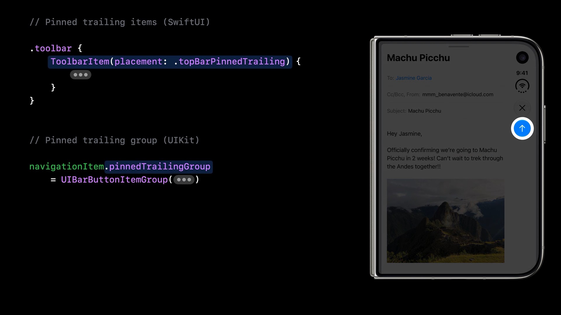
.topBarPinnedTrailing. Image: Apple, Raise the bar with iPhone Duo, 5:26.// SwiftUI
.toolbar {
ToolbarItem(placement: .topBarPinnedTrailing) {
// ...
}
}// UIKit
navigationItem.pinnedTrailingGroup = UIBarButtonItemGroup(/* ... */)You can easily support sarunw.com by checking out this sponsor.
Localization Buddy: Easiest way to localize and update App Store metadata.
Summary
To get vertical bars, rebuild with the latest SDK and use the bars your navigation containers provide. Custom UIToolbar, UINavigationBar, and UITabBar content is ignored.
Only containers along the display edge get a vertical bar, and items keep a top-to-bottom order of navigation, prominent actions, then everything else.
In the next article, we look at the items themselves: why a vertical bar prefers symbols, how the system picks between an icon and a title, and how to override that with the new axis behavior API.
Read more article about iOS, SwiftUI, UIKit, or see all available topic
Enjoy the read?
If you enjoy this article, you can subscribe to the weekly newsletter.
Every Friday, you'll get a quick recap of all articles and tips posted on this site. No strings attached. Unsubscribe anytime.
Feel free to follow me on Twitter and ask your questions related to this post. Thanks for reading and see you next time.
I also make short videos and visual guides on Patreon. Some things are easier to see than to read, like how an API looks and moves on a real screen. If you like to learn that way, come and watch. Sharing the article is also greatly appreciated.
Become a patron Tweet ShareBuild Siri experiences across apps, Part 2: Content Transfer
Let other apps act on your App Entities with Transferable and IntentValueRepresentation, and decide whether incoming content matches an existing entity or creates a new one.
Prepare toolbar items for a vertical bar
Why two pieces of data matter on iPhone Duo, how the system picks a representation, and how to override it with axis behavior.